This is a guest contribution by Tara Nair. Read more about her in the author bio below the post.
Hello, readers! I am glad to be here to make you aware of some of the facts that we usually neglect while starting on with a blog. I know you become so enthusiastic in the beginning, that what all matters to you is a head-start on the content and run. But hold… take a pause… you sure don't want to be the only one, present in your blog right? You also want lots & lots of readers to go through your blog and subscribe to it.
Now to make that happen, you also need to give your blog… good-looks, value and your personality. Honestly, as soon as someone hits your page the first impression is the upper fold of your blog i.e. the face of the blog is the one that doesn't include scrolling down. So let's get into the depth of the designing part of your blog… what all you need is…

Great header
There are few elements that will attract the readers and make them more curious about the blog. They are the header tabs and the about column (author in brief). Out of which header is the one that will be sending a loud voice out, about the look and feel of the blog. So make sure that the header sends a clear message to the reader about what does it contains by adding the name and also a tagline that defines the niche of the blog.

The Background
I have seen few of the blogs having starry skies, or a lot of beautiful patterns behind the content. Honestly, though that looks good, but at the same time, it may not give the same feeling to all readers. The background is suggested to be either plain black or plain white… for me it is better to have plain white because it then gives a chance to write with black ink that looks far better than the letters in white. Why plain colours, because it will help the images from content to pop-out and majorly because it makes the content rule the page (prime motto) not the background prints.
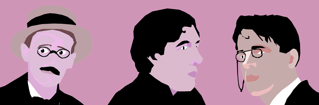
Your Face
There are a lot of blogs out there; that doesn't have the face of the blogger in their widget section. Not even in the about page. That is a big drawback since people won't be able to connect with the blogger. Also, his/her thoughts or knowledge that is shared in the blog will not win the trust and will signal the brain with a flag of fake. If that blog is your identity, then sure you must have your face pictured on it too. Am sure some of those blogs are getting a lot of hits indeed, but then your personality will remain hidden till you show your face.

Width of Picture v/s Width of Content
Though it is not at all necessary that your blog post must contain a lot of pictures, at least one good-quality photo at the beginning of the story will be of great help to the readers. Why? Because an image or a video has the power to drag the complete attention of the reader and make them glued to your content. Also, I have been through so many blogs that have the pictures that don't match the width of the content. It looks pretty unorganized and clumsy. If you are a serious blogger and want to earn from your blog n all, then better it would be to take the shot appropriately or do the graphic picture according to the width of the content.
The Power of Font
Yes, this means exactly the same as it sounds. The fonts have the power to make the show go bright n shine, or it will be a complete flop. I went across few of the blogs that have coloured fonts, that means… my friend… I will be out of there within seconds, and the same feeling is what the crowd gets.

If you want a particular word or sentence to stand out in the content, then go for bold, not even italics. Also, better to use not more than three different fonts. One for the topic, other for the content and the third shall be for a disclaimer or a tip or anything that comes at the bottom of the content with star marks.
Even though these are pretty strong points that a lot of internationally known bloggers stick with, but as they say, there are no rules to creativity and rules are made to be broken. So well, if you have something that is far better to come up with, other than the ones that have been shared here, then please do try them out and ask your readers about their views on it. Trial n Error must go on. I hope this post helps you in a lot many terms, still… if there's anything in your mind with regards to this, then please do reach out to me in the comments. By the way, what are your thoughts on the strength of having a good-looking blog? Please do let me know. Thanks for having me here. Enjoy!!

Author Bio : Tara Nair is a decor blogger at crimsonapril.com. She is also a Calligrapher and a creative energy magnet. She is very much into learning new artsy skills, which she then further implements into interiors to add personality to a home.
Image source: Pixabay
©2015Digitaldimensions4u.com The content is copyrighted to Reji Stephenson and may not be reproduced on other websites.


No comments:
Post a Comment